
Brand Guidelines
- Since 2015
- Coffee, pie and food
- Natural wine and craft beer
Contents
Everything that makes Idle Hands look and sound like itself. Keep these close and the brand stays recognisable wherever it turns up.
Foundations
This is the Idle Hands Brand Identity Style Guide. It tells you who we are, what we stand for, how we talk and how we look, whenever and wherever Idle Hands shows up in the world.
Our Story
The best moments happen when we slow down.
Idle Hands was born from a belief that the best moments happen when we slow down. Tucked into the true heart of Manchester, we’re a coffee shop built on care: for ingredients, for process, and for the people who pass through our doors. Every cup we serve is thoughtfully sourced and carefully brewed, celebrating quality without pretence.
We draw inspiration from the tactile, the handmade, and the imperfect beauty of everyday rituals: the warmth of a mug, the pause between sips, the quiet satisfaction of something done well. At Idle Hands, coffee isn’t rushed. It’s considered, comforting, and made to be enjoyed.
Our Mission
“We exist to explore coffee as a craft, serving carefully sourced brews and iconic, freshly baked pies in a space built for conversation, curiosity, and consistency.”
Our Vision
To be Manchester’s most cherished independent coffee house.
A place where every cup, pie, and conversation invites people to slow down, explore, and connect. We envision more than a cafe: a space where quality coffee and handcrafted food spark curiosity, community, and conversation. By celebrating coffee as a crop that reveals new flavours with every brew, and pie as an iconic part of our menu, we want to create moments worth savouring, from first sip to shared stories.
Our Positioning
Idle Hands is an independent coffee shop rooted in craft, curiosity, and consistency. We focus on thoughtfully sourced coffee, carefully brewed in multiple ways, alongside handmade food that’s made with the same attention to detail. We believe coffee is more than a routine: it’s a process, a conversation, and something worth taking time over. Our space is designed to feel welcoming and unpretentious, inviting people to slow down, explore flavour, and enjoy quality without intimidation. Whether you’re deeply interested in coffee or simply here for a great cup and a slice of pie, Idle Hands exists to make every visit feel considered, relaxed, and genuinely satisfying.
Approach & Voice
Considered in how we look, warm in how we speak.
We don't want everything to look the same. We want everything to feel like us: whether it's a flat white, a shopfront, or a single line of copy.
Logo & Mark
Calm, considered, quietly confident.
Horizontal lockup
Logo breakdown
The mark, in pieces



Clearspace
Always keep clear space around the logo, at minimum the height of the capital H in the wordmark on every side. No type, image, or graphic should enter this zone, and the logomark holds its own clear space of one quarter of its width.


Misuse
Using it incorrectly weakens the brand.
Tap any example to correct it.

Minimum size
Legibility comes first. Do not reproduce the wordmark any smaller than 28 mm wide in print, or 150 px on screen. The standalone mark may go smaller, down to 8 mm or 24 px. Below these sizes, switch to the mark or give the logo more room.
Colour
Applying Colour
These charts show the approximate proportion of each colour across the Idle Hands identity. The same palette runs through everything, but the balance shifts between screen and street.
Digital stays disciplined: warm neutrals do the heavy lifting, Blueberry Pie is reserved for buttons and links, and accents are barely a whisper. In the shop it loosens up. Honey, blush and light blue get more room across signage, packaging and the space itself, so the place feels a little more playful than the website.
Approximate colour use
Typography
Expressive serif, quiet sans.
Aa
The best coffee in Manchester
The Seasons
- H2 · Larger headingThe Seasons52 ptLeading 63 · Tracking +2
- H1 · Regular headingThe Seasons32 ptLeading 39 · Tracking −2
Our primary typeface. Elegant serif details and a warm, organic character for headings and key messaging.
Aa
Considered, comforting, made to be enjoyed.
Inter
- SubheadingInter Medium20 ptLeading 24 · Tracking +31
- BodyInter Regular12 ptLeading 16 · Tracking 0
- CaptionInter Light8 ptLeading 10 · Tracking 0
Our supporting typeface. Clean and modern, it keeps subheadings, body, and captions clear and legible without competing with the serif.
Typographic hierarchy
Sizing NotesLarger heading
Display moments and statement headlines. Use sparingly, with plenty of room around it.
Regular heading
Section and chapter titles. The slight negative tracking keeps it composed.
Subheading style
Leads a block of copy. The wide tracking sets it clearly apart from the serif for flawless hierarchy.
Body copy keeps things calm and legible.
The workhorse for paragraphs. Cap the measure at 65 to 75 characters.
Caption and fine print
Labels, footnotes and small print. Keep it brief.
Brand in Action
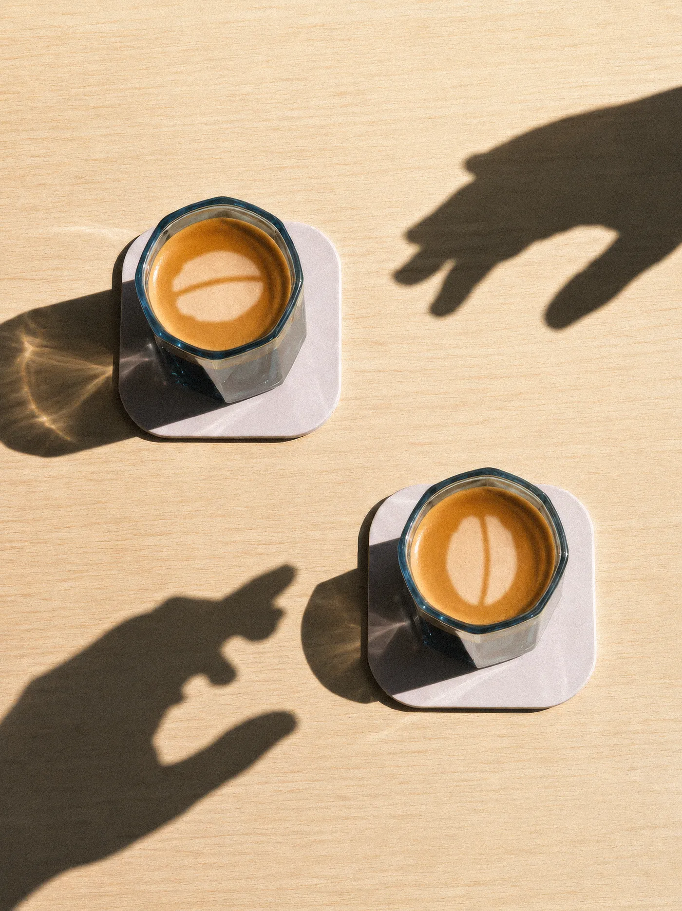
The brand, out in the world.
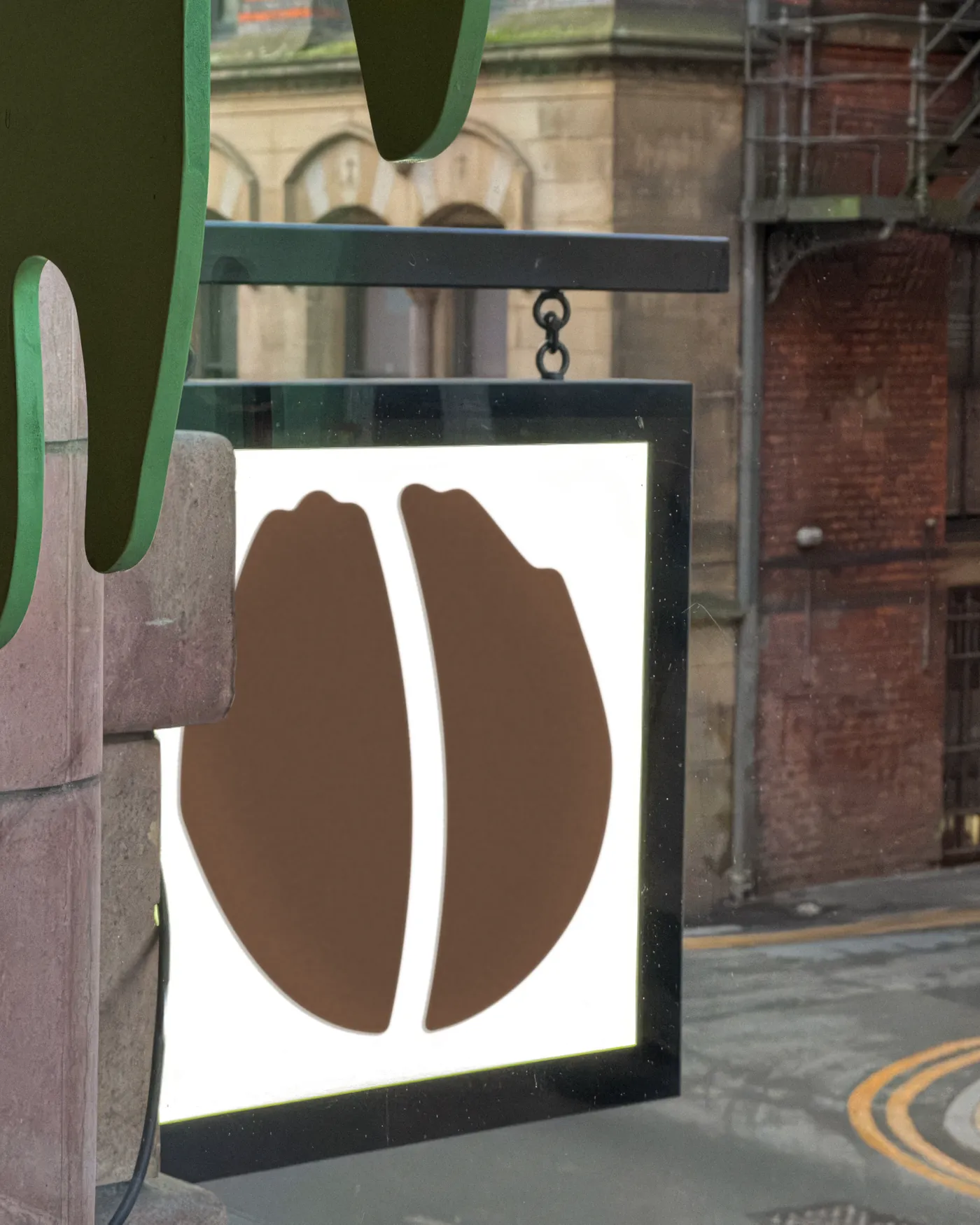
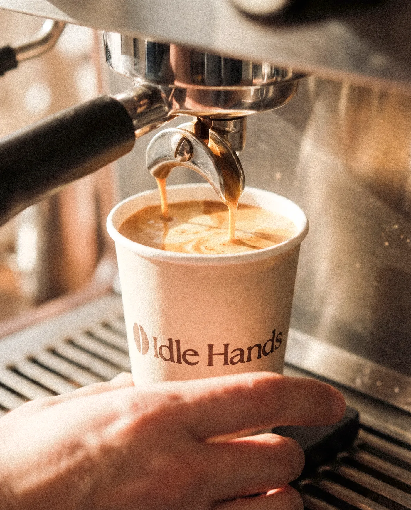
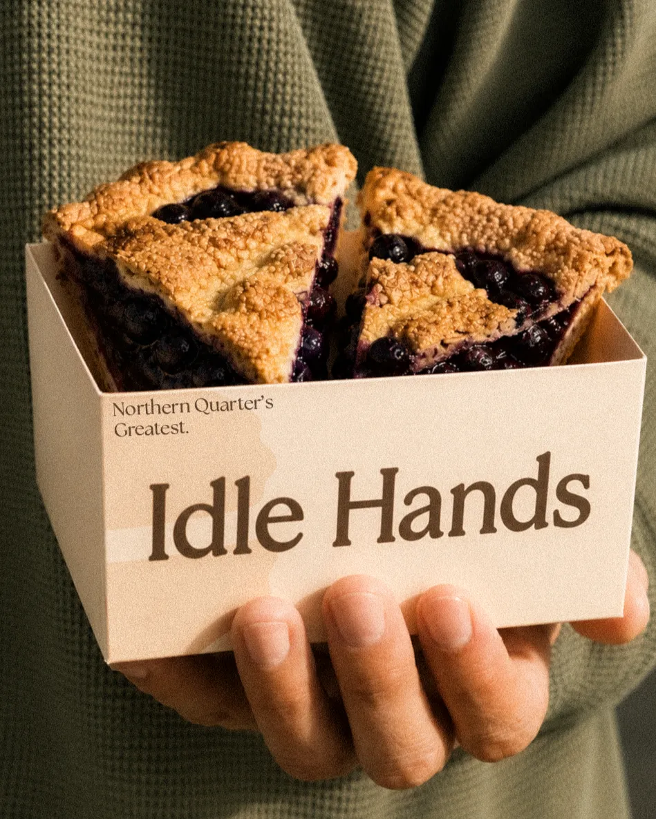
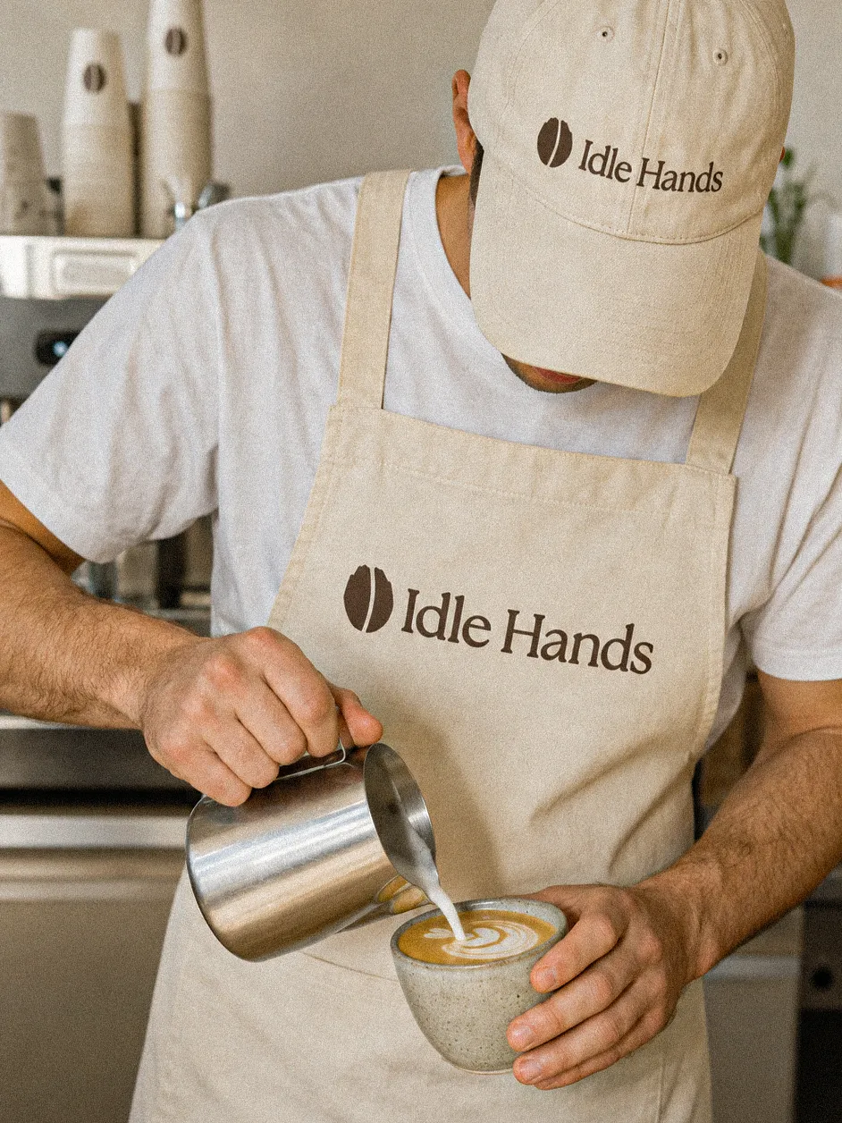
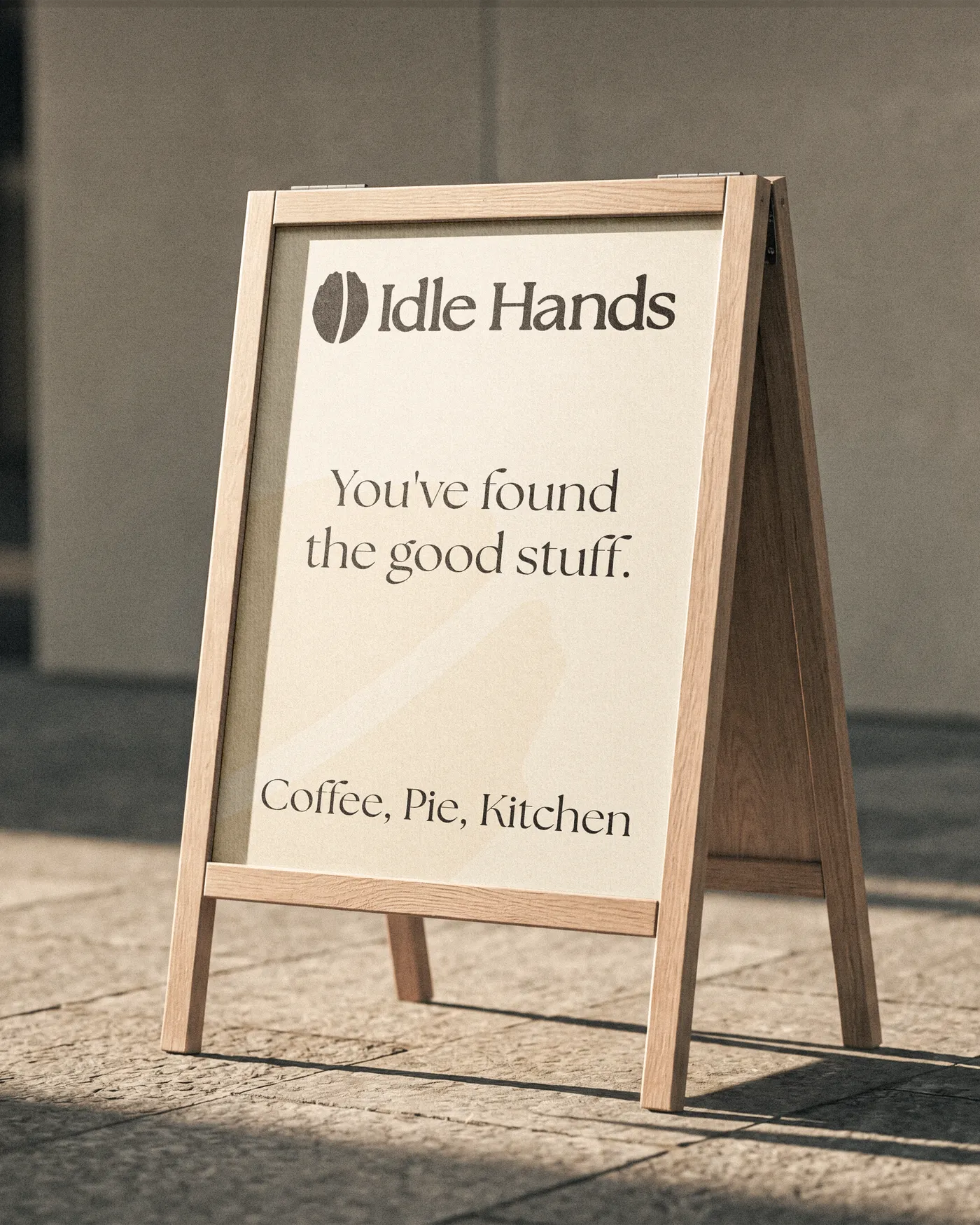
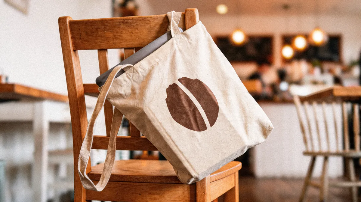
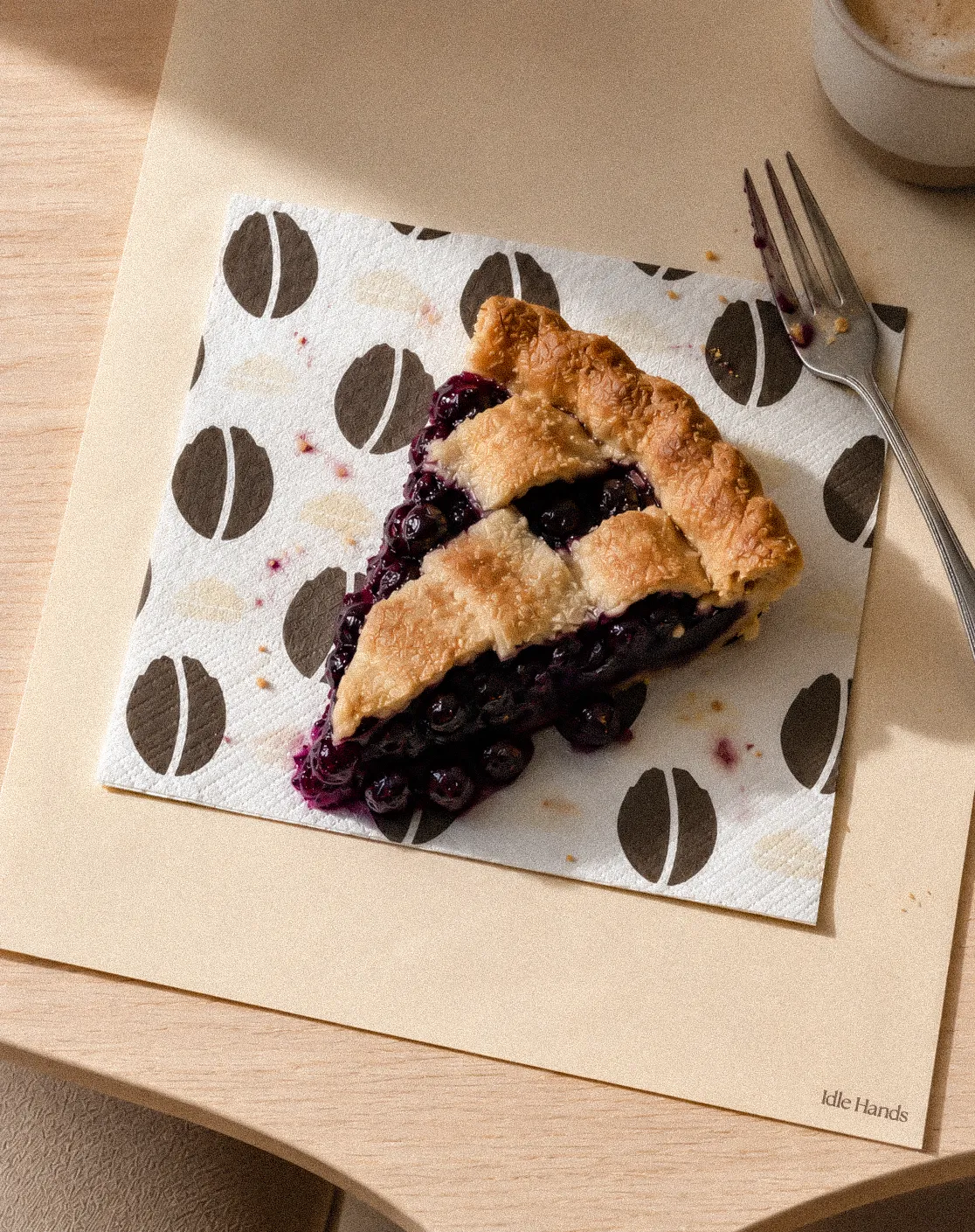
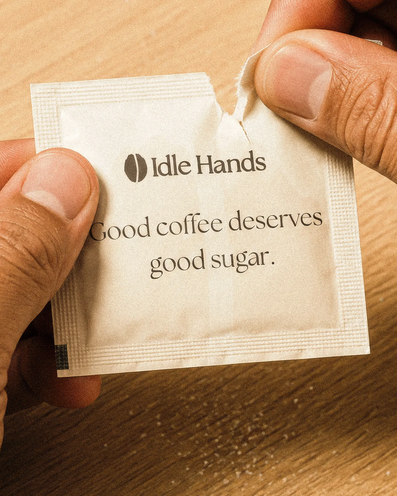
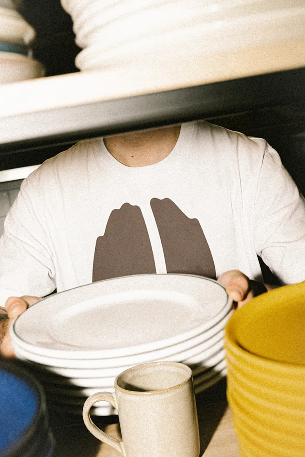
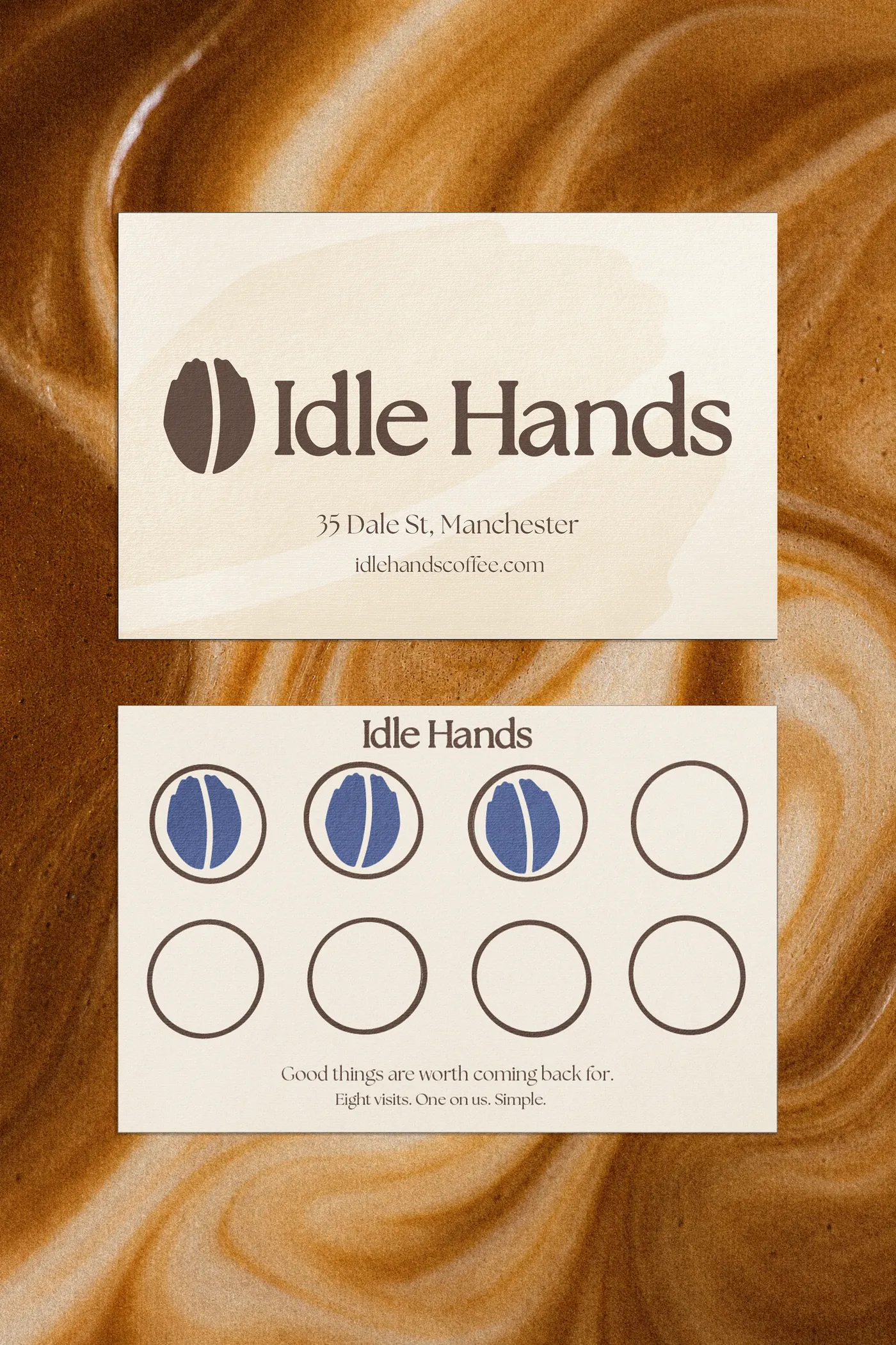
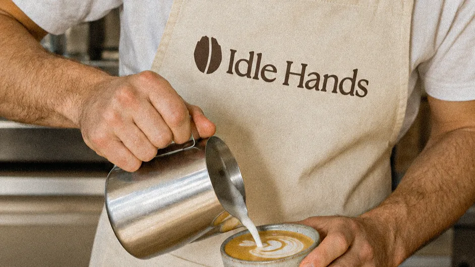
Thank you.
We sell coffee, pie and food in Manchester’s Northern Quarter.